hi,
we are
The Young.
Agency for creative
brand development.
Why The Young? ‘Young’ is not an age. Neither a generation. It’s not hip, hype or happening. It is a way of looking – a perspective on growth, driven by curiosity and a desire for development. Young means to us: What if? It’s about wonder, and the willingness to experiment. The power of imagination.
contact
info@theyoung.agencyThe Rotterdam studio:
Baan 74, 3e etage
3011 CD Rotterdam

work with us
We are always excited for creative and curious minds to join us at The Young. andre@theyoung.agency
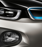
We develop Brand Concept Cars
As the name implies, a concept car is an inspiring combination of idea and reality, simultaneously demonstrating both an organization’s unique strategic intent and practical capabilities.
More than a simple prototype, it brings to life the priorities, values and vision that will guide the organization forward in the immediate future, and serves as a tangible brand statement that says, ‘This is where we intend to go now.’
While automotive brands generally use concept cars to communicate externally to the press, a brand ‘concept car’ is also a powerful tool for the strategic orientation of internal audiences. In the process of organizational change, one relevant, concrete example can be worth more than a thousand PowerPoint decks!
Of course, a brand ‘concept car’ doesn’t have to be a physical product designed for sale. It could be anything: a new service offering or internal system, a refreshed brand design language or communications idea.
No matter what form it takes, in order to succeed in moving organizations forward, a powerful brand concept car needs three key characteristics:
1. Inspirational
It is inspirational but achievable in the near future. It requires change and may even surprise some people, but it is not a BHAG. It is grounded in realistic expectations of near-term circumstances and available resources
2. Brand Relevant
It is brand-relevant. It is not simply a general view of the future. It demonstrates a distinctive brand perspective on that future and how this particular organization will use its strengths to take advantage of those circumstances.
3. Collaborative
It connects the efforts and input of multiple stakeholders. From a practical perspective, it must have widespread support. It cannot be seen as only one group’s project. And from a symbolic perspective, a brand statement should show how the organization’s functions work together, as one brand.
And in order to produce a successful brand concept car, you need to combine three key areas of expertise:
1. Research
Concepting is always grounded in a deep understanding of the relevant technologies (What is possible?), social environment (How will it be used and by whom?) and intent (What effect does the organization want to create among current audiences?)
2. Strategy
Translating today’s intent into tomorrow’s product or service requires the ability to think strategically; to identify and amplify the often subtle connections between what you want to say and what audiences need to hear.
3. Design
Design expertise is what turns a well researched, strategically sound idea into something that people can actually visualize, appreciate and desire. Whether the ‘concept car’ itself is a new thing, a new way of doing things or a new way of communicating them, design makes the final difference.
